It’s now been a month since I started vlogging. Therefore, it’s a good time to quickly take stock of my costs to-date and evaluate the budget creep. Let’s take a look at my total expenses to date. Basic vlogging items (excl. sewing) Item Cost Description Camera $0 (existing) Pentax K-50 (purchased approx. 5 yrs ago)
Month: October 2020
Vlogging diary wk 4: Hitting hard limits
Good news for the week: I have now got Pandas for Productivity down to a science! Now I can film, edit and upload a 5-minute episode within 4 hours. Since I will be going back to a full-time job soon, I must edit fast to maintain my vlog. However, my $0 budget goals are being
Pandas for Productivity Vlog Ep3: Creating time series-based ranges in NumPy
Why this topic? There’s a lot of documentation on using Numpy’s arange function to create ranges of numbers. However, not much is said about creating date- and time- based ranges, which are much more useful for business. What it covers: First, I give a quick review of the NumPy arange function syntax. Then, I walk
Vlogging diary wk3: Failing up!
Finally, I feel as if I’ve broken through some of the core challenges towards making a polished-looking vlog. In this post, I relate my key learning from creating the 2nd episode of Pandas for Productivity. The motivation for this week’s tutorial is that I recently did 2 analyses on COVID-19 data with more complex data
Pandas for Productivity Vlog Ep2: Think like a data engineer!
Why this topic? When we join two flat files, or a flat file to a SQL query output in Python, they probably come from 2 different sources. Therefore, we can’t assume that they’re engineered to be combined directly. What it covers: I walk through 2 examples of joining data from completely different sources. In both
Pandas for Productivity vlog Ep1: Relabeling x-axis in Matplotlib
Welcome to the launch of the Pandas for Productivity vlog series! Here, I discuss the peskier data wrangling challenges that you may encounter. For my first episode, I show you how to relabel the x-axis on a stacked area time series chart in Matplotlib. Why this topic? Matplotlib has been inconsistent with plotting time-series data.
Vlogging diary wk2: Creating a first tutorial
Whee! I’ve just created and posted my first tutorial. Furthermore, by and large I achieved my vision for the look and feel. However, I didn’t fully succeed with getting under 5 minutes (it was 6 minutes 45 seconds). For future reference, here’s my journal of the process and experience. Upgrading my lighting Firstly, my new
The uncommon sense in making your first vlog
Over the weekend, I finally posted my first vlog. Incidentally, this was also my first-ever attempt at video. Before getting to this point, I failed hard and fast for 5 full days. While some of the things I struggled with might seem obvious to the “digital native” generation, I had a very steep learning curve.
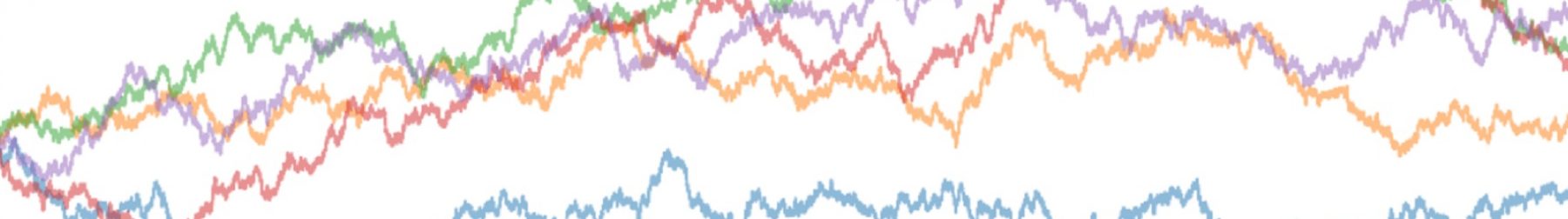
Plotting charts in Python vs. Excel: A Demo
We previously discussed here that plotting charts in Python is second priority for beginners. Indeed, Python’s matplotlib library is very useful for creating elegant charts from large data sets. However, you need to remember a lot of code to make it work well! Example: COVID-19 public data set We will use the COVID-19 Case Surveillance