We previously discussed here that plotting charts in Python is second priority for beginners. Indeed, Python’s matplotlib library is very useful for creating elegant charts from large data sets. However, you need to remember a lot of code to make it work well!
Example: COVID-19 public data set
We will use the COVID-19 Case Surveillance Public Data to demonstrate the difference between Excel and Python for plotting charts. For example, suppose we want to see whether we’ve improved at protecting senior citizens. Then, the two simplest charts we could look at are:
- How many cases there were over time in each age group.
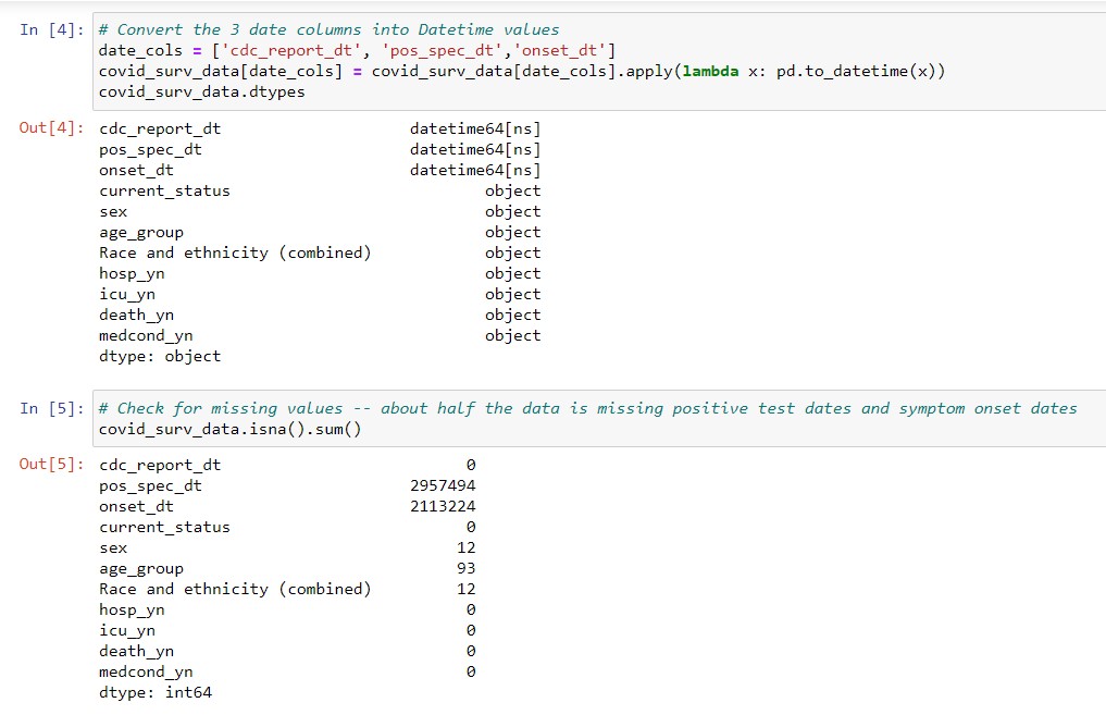
- The percentage of total cases in each age group.
The data set is too big for Excel, so we need to analyze it in Python first
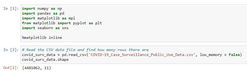
First, we download the .csv data file and read it to Python. As we’ve probably guessed from reading the news, the data has several million rows.
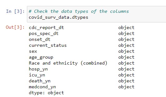
Each row in the data set represents one COVID-19 patient, and contains details about them. We can look at the data columns and their data types using the code below. Hence, we find that every column has text data.
Before we do any plotting, we need to first transform the date columns from text into dates. To this end, we use the pd.to_datetime function. Subsequently, we also check whether the DataFrame has missing dates, using .isna(). Because the positive test date (pos_spec_dt) and the symptom onset date (onset_dt) each have more than 2 million missing values, we can only use the date that the case was reported to CDC (cdc_report_dt).
Cleaning the data and grouping into daily time series by age group
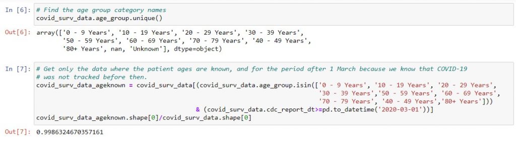
Second, we want to clean the data to just the records which have a patient age and are after March 1. With the code below, we can see that we still have 99.8% of the original rows. Therefore, our data should still be fairly representative of the original set.
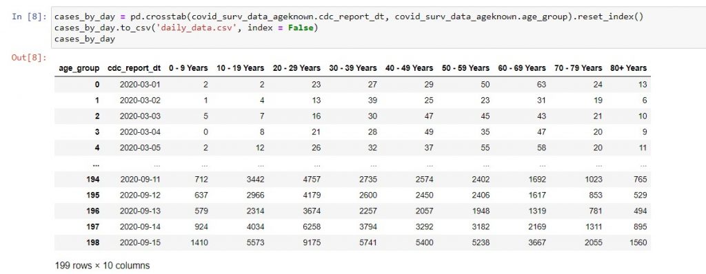
Third, we can use pd.crosstab to group the data with the CDC report date as rows, and the number of patients in each age group for that date as columns. We will then get 199 days’ worth of data from March 1 to September 15, which we can write to a .csv file.
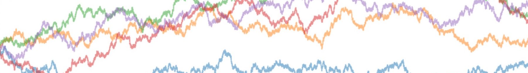
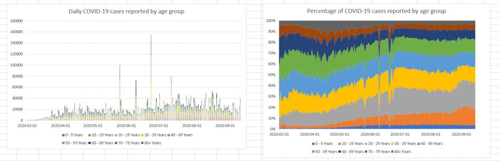
At this point, we can take a look at the daily trends in Excel. Below, I created the two charts using Excel’s default settings. The only change I made was to edit the chart titles to show clearly what we are plotting. We can see that the data is rather noisy, with huge spikes on a few days. Therefore, we can’t really see if there was a spike in senior citizen case numbers, even though we can tell that the percentage of total cases affecting senior citizens aged 60 and above has decreased over time from over 30% of the total, to stabilize at about 20%.
At this point, hopefully you appreciate how Python can convert 4.5 million rows of data into 199 rows that you can plot in Excel, with just 5 lines of code! Still, we can do more to make the charts easier to interpret.
Regrouping the data into weeks for plotting charts in Python
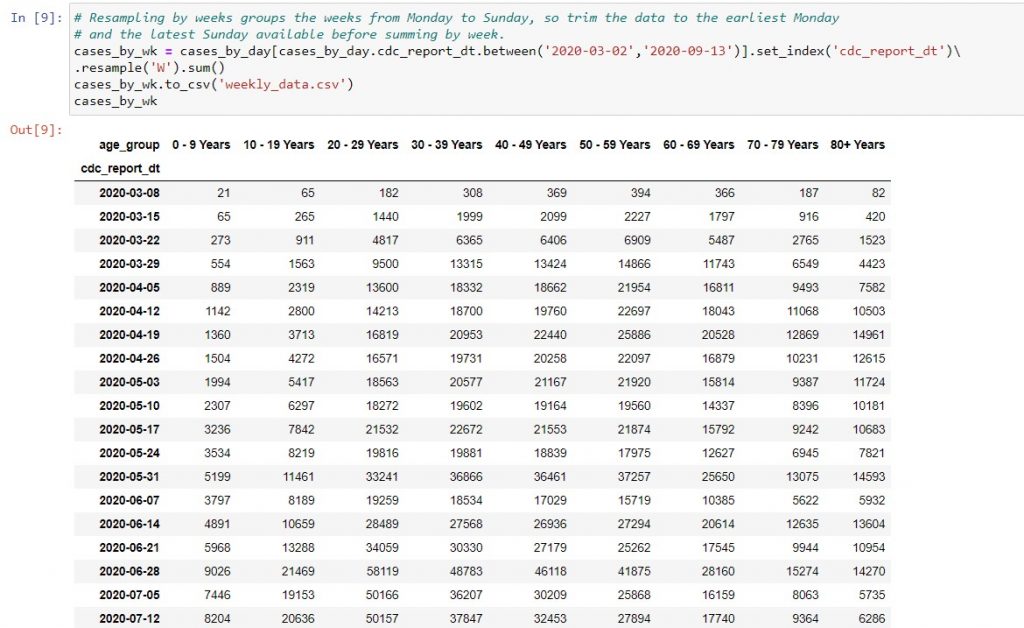
Fourth and last, we want to group the data into weekly totals, to get rid of the sharp daily variations. Because the .resample method groups weeks from Monday to Sunday, I filtered the data to the earliest Monday and the latest Sunday before using it. Also, I set the index of the DataFrame to the CDC report date, because .resample only works when the dates are in the index column.
You can see “method chaining” in the code above, meaning that we string together as many methods as possible in the order that we want to perform them. Experienced programmers like to do this, in order to use fewer lines of code. Also, the back slash after set_index indicates that the code will continue on to a new line. This is useful when you have a line of code that is wider than the page, and want others to read your code without having to scroll right.
Plotting charts in Python vs. Excel: weekly stacked bar chart
As a start, let’s try plotting the stacked bar chart of total weekly cases in Excel and Python. If we stick to only the bare minimum edits (i.e. just the chart title), neither chart is particularly reader-friendly.
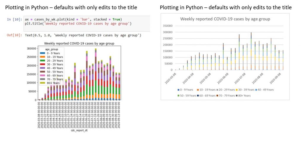
| Problems with Python chart | Problems with Excel chart |
| 1. Legend overlaps with the data. 2. Horizontal axis has date-times instead of dates, so it looks cluttered. 3. Horizontal axis has a title cdc_report_dt from the raw data, which is unsightly. | 1. Columns are spaced out too widely. This is because Excel expects there to be daily data, as the horizontal axis has a date format. However, we only have one data row per week. |
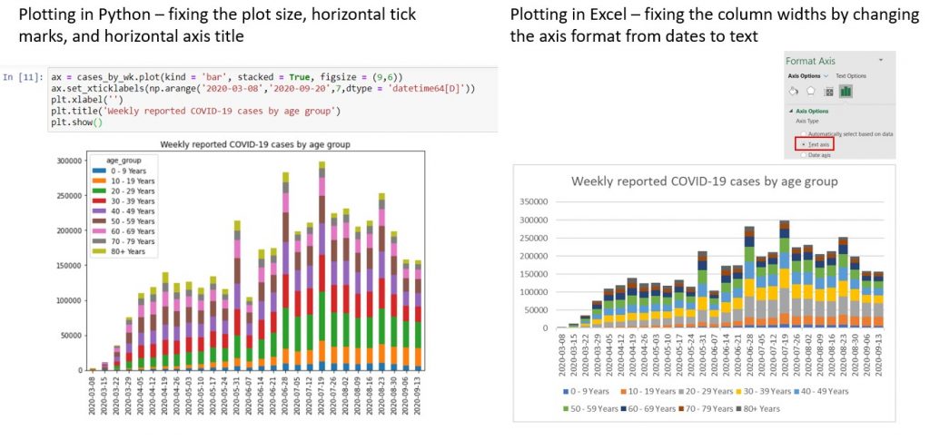
Next, let’s try to fix the various visual problems. In Python, we need 2 more lines of code to replace the horizontal axis tick marks with dates, and remove the axis title. We also have to put one more keyword argument when calling the .plot method, to make the plot bigger. Conversely, for the Excel chart, we only need to re-format the horizontal axis from a date format to a text format, to get rid of the unsightly gaps.
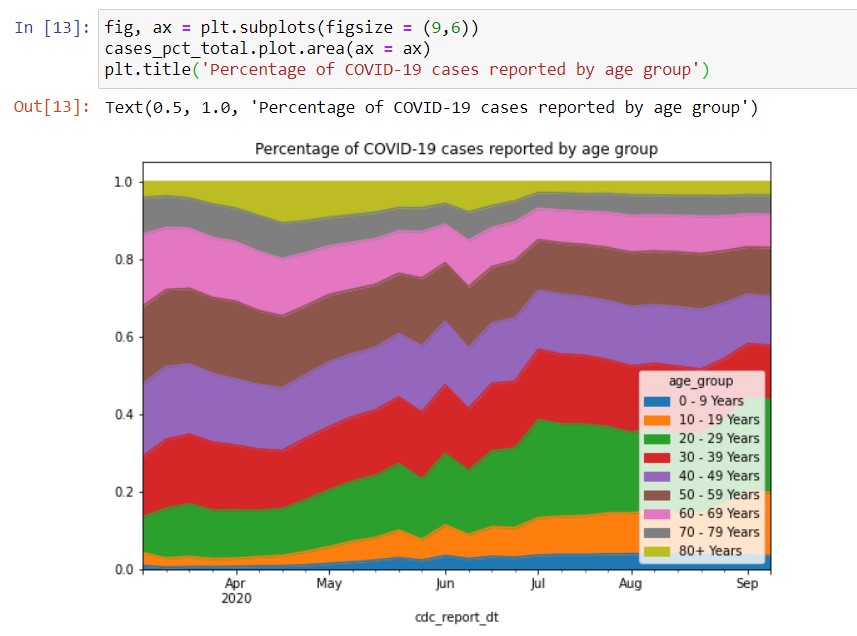
Plotting a stacked area chart in Python vs. Excel
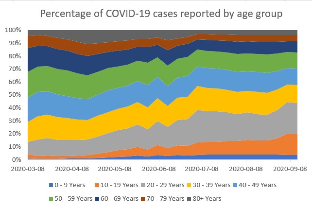
Even though our charts are more aesthetically pleasing now, we still can’t easily draw conclusions about the impact on senior citizens. Because the overall bar heights are so different, it’s difficult to tell if the proportion of cases that are senior citizens has increased or decreased. Therefore, we can try creating a stacked area chart instead.
In Excel, we can do this in a minute or two – just select the data, choose a stacked area chart and edit the title. Not only do the results look presentable, they are easy to read and interpret.
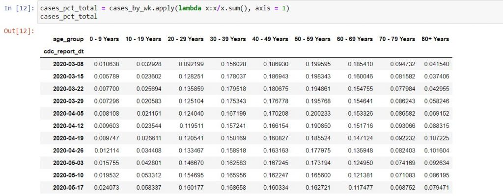
Unlike Excel, we need substantial coding to create the same chart in Python. Firstly, we have to convert the data from raw case counts to the percentage of total in each week for each age group.
Secondly, we need to configure the plotting command for the area chart differently from the stacked bar chart, because of restrictions in the chart types supported by the various plotting methods. When plotting charts, we are using a mixture of three different types of code: the .plot method in pandas, the pyplot API* in matplotlib, and occasionally directly modifying axes objects in the charts. It can get very confusing unless you have a good “cookbook” style reference text, and have the time to consult Stack Overflow when you’re stuck.
* API = Application Programming Interface. Think of it as a “service” where you structure a request in a specific way to get back data, or in this case, to get specific changes to your chart. That way, you don’t need to understand or program all the code that it took to perform that task.
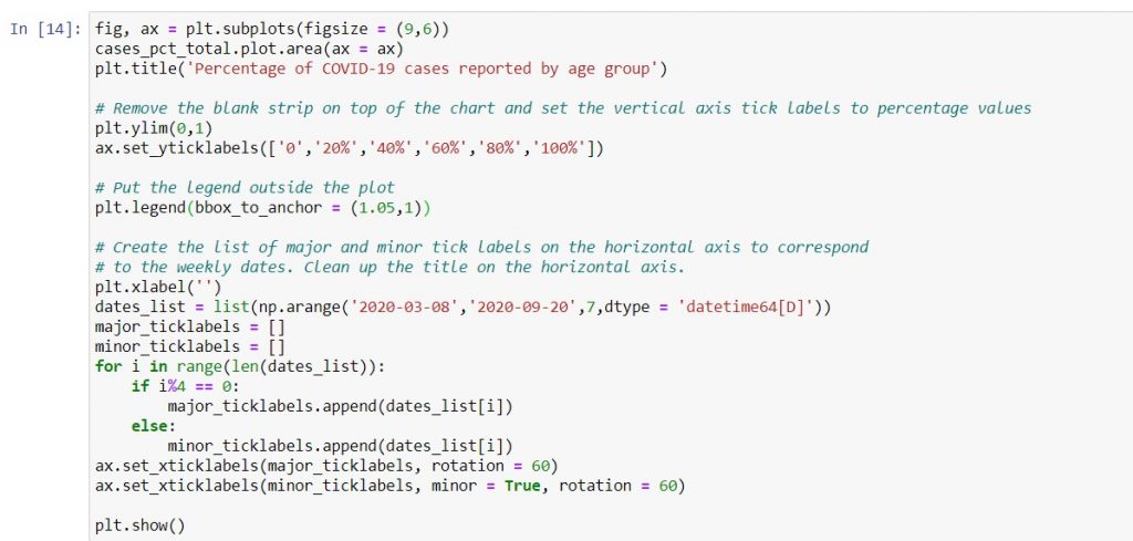
Fixing the problems with the stacked area chart
Our plot now has 3 problems:
- The legend overlaps with the data, obscuring the lower right hand corner of the plot.
- There is a strip of blank space above 1 on the vertical axis, which is unsightly. It also makes no sense because all the values should add to 1.
- cdc_report_dt (the name of the DataFrame index) is the default horizontal axis title. Again, this is unsightly.
- It’s also unclear what the start date is, as the chart only shows the major tick labels. Actually, the minor tick labels are blank.
We need substantially more code to fix the area chart than the bar chart, specifically because we can’t map the x-axis to all its tick labels at one shot.
However, after all this work, the chart looks just as clean as the Excel one. It just took almost 20 more lines of code to get there!
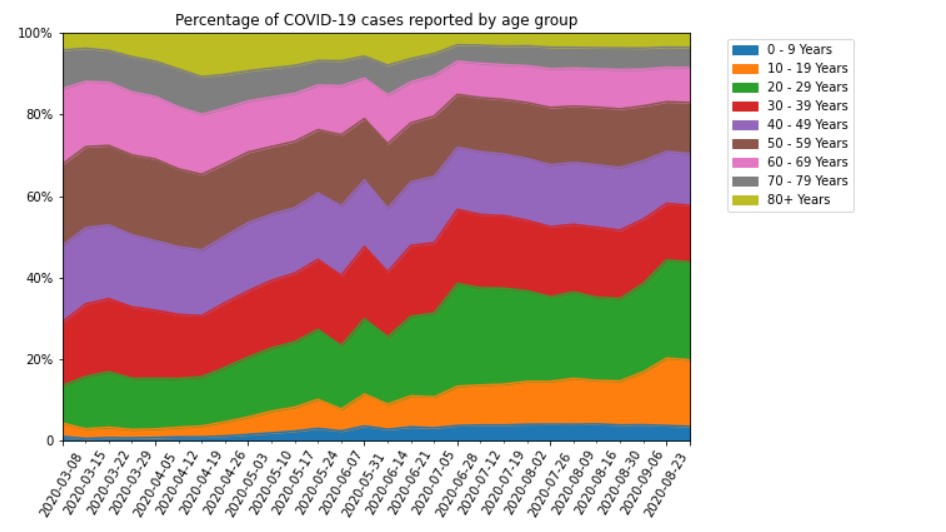
Afternote: This code would have worked if the major tick marks were evenly spaced to every 4 minor tick marks. Subsequently, I realized that the major tick marks have uneven spacings. Therefore, the coding process is slightly more complex than described above. I’ve posted a tutorial about the final process on my Youtube channel as below:
Conclusion: Python is more flexible but much more complex than Excel for plotting charts.
“Show, don’t tell”. With this mantra, I set out to create this demo – and ended up with only half of the planned content after all these words! Hopefully, this will demonstrate to you that Python allows a lot of flexibility to tweak different parts of charts. Unfortunately, that can create too much complexity. For example, I created the Excel version of the stacked area chart in a couple of minutes, but took 2 hours to debug the re-labeling of the x-axis in Python.
Therefore, I’ve deliberately left charts out of the Pandas for Productivity series scope. This doesn’t mean that you will never use matplotlib and seaborn. Rather, it means that you’ll choose to use it if you need to make complex statistical plots (e.g. box plots, violin plots, probability density functions). Otherwise, you might use it for scatter plots of more than a million rows of data. But for straightforward business charts, it’s much quicker to use Excel.
Happy plotting!