Welcome to the launch of the Pandas for Productivity vlog series! Here, I discuss the peskier data wrangling challenges that you may encounter. For my first episode, I show you how to relabel the x-axis on a stacked area time series chart in Matplotlib.
Why this topic?
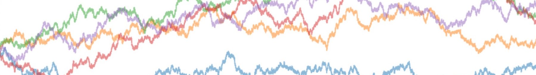
Matplotlib has been inconsistent with plotting time-series data. Sometimes, it labels the data nicely out of the box. At other times, I get really ugly default values in the x-axis. Because Stack Overflow and the official documentation don’t provide an end-to-end manual, I want to document my problem-solving process.
What it covers:
- Shows how a set of weekly time-series data looks in an area chart under Matplotlib defaults, and why the output is confusing.
- Illustrates the ways to extract the x-ticklabel locations and troubleshoot how Matplotlib is labeling the axis.
- Demonstrates a solution where we map the desired x-ticklabels to Matplotlib’s default tick locations to relabel the axis.